
AMERICA AS A VISUAL IDENTITY
This year, America marks its 250th birthday. On July 4, 2026, the United States commemorates the 250th anniversary of the Declaration of Independence, a founding document from 1776 that symbolizes freedom, self-governance, and the nation’s break from British rule.
On this semiquincentennial milestone, we can reflect on the country’s past and present through another lens.
America as a brand.
Not in a commercial sense. Not as a campaign, product, or logo system. But as a visual identity that has carried meaning across generations. A brand, in its simplest form, is a name, design, symbol, or feature that creates recognition. By that definition, America has one of the most recognizable brand identities in the world.
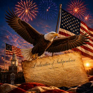
Say “America,” “Fourth of July,” or “Made in the USA,” and certain images come to mind almost instantly: the flag, red, white, and blue, fireworks, a bald eagle, a baseball field, a backyard grill, a small-town parade, a label on a product, and a porch with a flag moving in the wind.
Those visuals do what strong brand visuals are supposed to do. They create recognition. They carry emotion. They remind people of something bigger than the image itself.
THE FLAG AS A BRAND SYSTEM
The most visible part of America’s brand identity is the flag, first adopted in 1777. Its design is simple, but it holds a lot of meaning. The original flag had 13 stars representing the first 13 colonies. Today’s flag features 50 white stars representing the 50 states and 13 stripes for the original colonies.
While the original flag design did not assign formal meaning to the colors, common interpretations associate white with purity and innocence, red with valor and bravery, and blue with vigilance, perseverance, and justice.
That is a strong visual system. Three colors. A consistent pattern. A symbol that can be recognized from a distance, reproduced in countless formats, and understood across languages.
For businesses, there is a lesson in that simplicity. The strongest visual identities are not always the most complicated. They are the ones people can recognize quickly, remember easily, and connect to something meaningful.
THE BALD EAGLE AS A SYMBOL
The bald eagle became part of the Great Seal of the United States in 1782, where it was used to represent strength, unity, and independence. In the eagle’s talons are an olive branch and arrows, symbols of peace and defense. For nearly 250 years, the eagle has appeared on official documents, currency, government buildings, military insignia, and other symbols of national identity. Only in December 2024 was it officially designated as the national bird of the United States under federal law.
From a design perspective, the eagle works because it is both literal and emotional. It is strong. It is native to North America. It has scale, movement, and presence. It communicates independence and freedom without needing explanation.
That is what good symbolism does. It gives people something to recognize and rally behind.
THE PEOPLE NATURALLY BECOME PART OF THE BRAND
Of course, America’s brand is not limited to official symbols. It also lives in culture and experiences.
For some people, the Fourth of July looks like hot dogs, hamburgers, watermelon, sparklers, and folding chairs in the grass. For others, it is baseball, beach days, lake weekends, community concerts, or watching fireworks from a driveway. These are not official brand assets, but they have become part of the larger visual language.
They create a shared feeling.
America has grown from an estimated 2.5 million people across the 13 colonies in 1776 to more than 341 million people today. That kind of growth brings different perspectives, different traditions, and different lived experiences. But strong brands do not require every person to experience them the same way. They need enough shared meaning for people to recognize themselves in the larger story.
That is where the American brand still has power.
No matter where someone stands politically, the core visuals of America continue to point to ideas that are larger than a headline or a moment in time — Freedom, Opportunity, Pride, Service, and Community.
WHAT NATION BRANDING TEACHES US
Viewed through the lens of nation branding, those shared visuals do more than create recognition. They shape perception.
A strong nation brand can influence tourism, trade, exports, investment, talent attraction, cultural influence, and international relationships. Countries are often recognized not only for what they produce, but for the meaning attached to those products.
That meaning is built over time. It comes from symbols, stories, products, places, people, traditions, and experiences. It is not just what a country says about itself. It is what others believe, remember, admire, question, or associate with it over time.
For businesses, there is a lesson here. A brand is not just how something looks. It is how the visuals, language, symbols, and culture work together over time. A color palette can become a memory. A symbol can embody a feeling. A repeated experience can become trust.
America’s 250th birthday is a reminder that brands are built through consistency, meaning, and emotion. The strongest ones do not just identify who they are. They give people something to recognize, remember, and stand behind.
And after 250 years, the symbols of freedom still do exactly that.